Floral pillow covers have a reputation problem. For most people the word still conjures a 1980s conservatory: pale chintz, ruffled edges, everything faded and slightly apologetic.
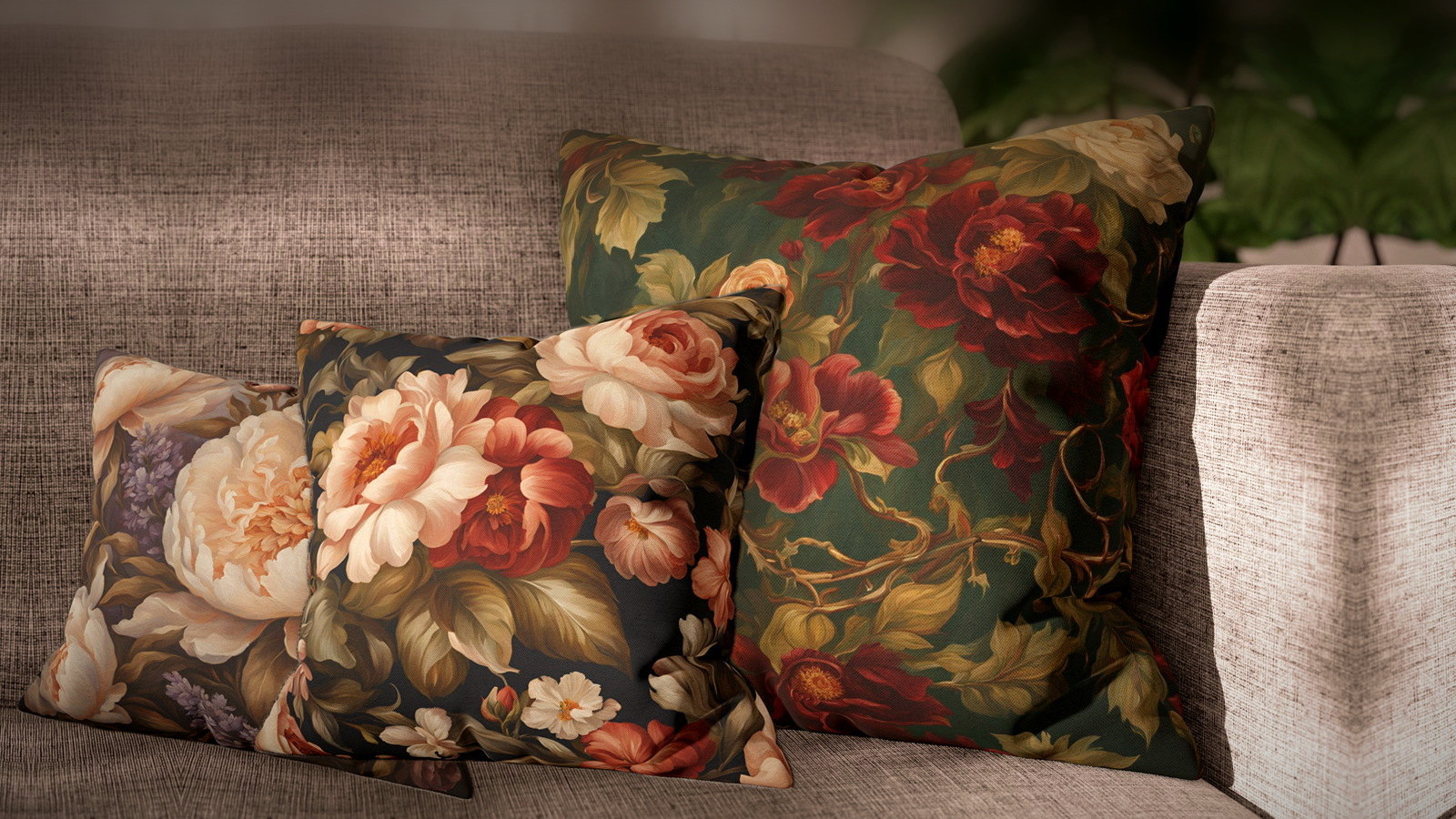
The version that has come back is almost the opposite. The flowers are painterly rather than sweet, and — this is the part that matters — they sit on dark, saturated grounds rather than cream ones. That single change is what separates a floral that looks current from one that looks inherited.
The ground color is the decision, not the flower
People choose florals by flower — roses, peonies, dahlias. It is the wrong variable. From more than a few feet away you cannot reliably identify the species anyway; what you read is the background, because it occupies most of the surface.
So choose the ground first, exactly as you would choose a solid. Then the flower is a detail you enjoy up close, which is the correct order of operations.
Dark grounds — the ones that read as deliberate
A dark ground does something a pale one cannot: it makes the flowers glow rather than fade, and it lets a floral behave like an anchor instead of a filler. On a mid-tone sofa these are the covers that hold a corner.
- Cream Peony on Dark Umber is the darkest of the set and the closest thing here to a neutral — warm brown reads almost as a solid across a room.
- Crimson Roses on Forest is the most saturated pairing: deep green ground, red bloom, no compromise in either direction.
- Blush Peonies on Charcoal is the one to use when the room is already warm and needs something to cool and weight it.
Mid grounds — for rooms that already have a dark piece
If the sofa itself is charcoal or navy, a dark-ground floral disappears into it. These sit a step lighter and stay legible against dark upholstery.
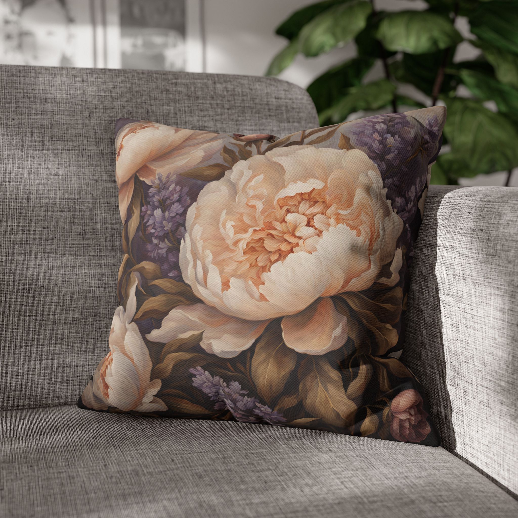
- Coral Dahlias on Teal — teal is the most useful floral ground there is, because it works against both warm and cool upholstery.
- Rose & Daisy on Teal Blue is the busier of the two teals and wants quieter company.
- Coral Peony on Duck Egg is the lightest thing here that still has a real ground color rather than a tint.
Soft grounds — the ones people expect, done properly
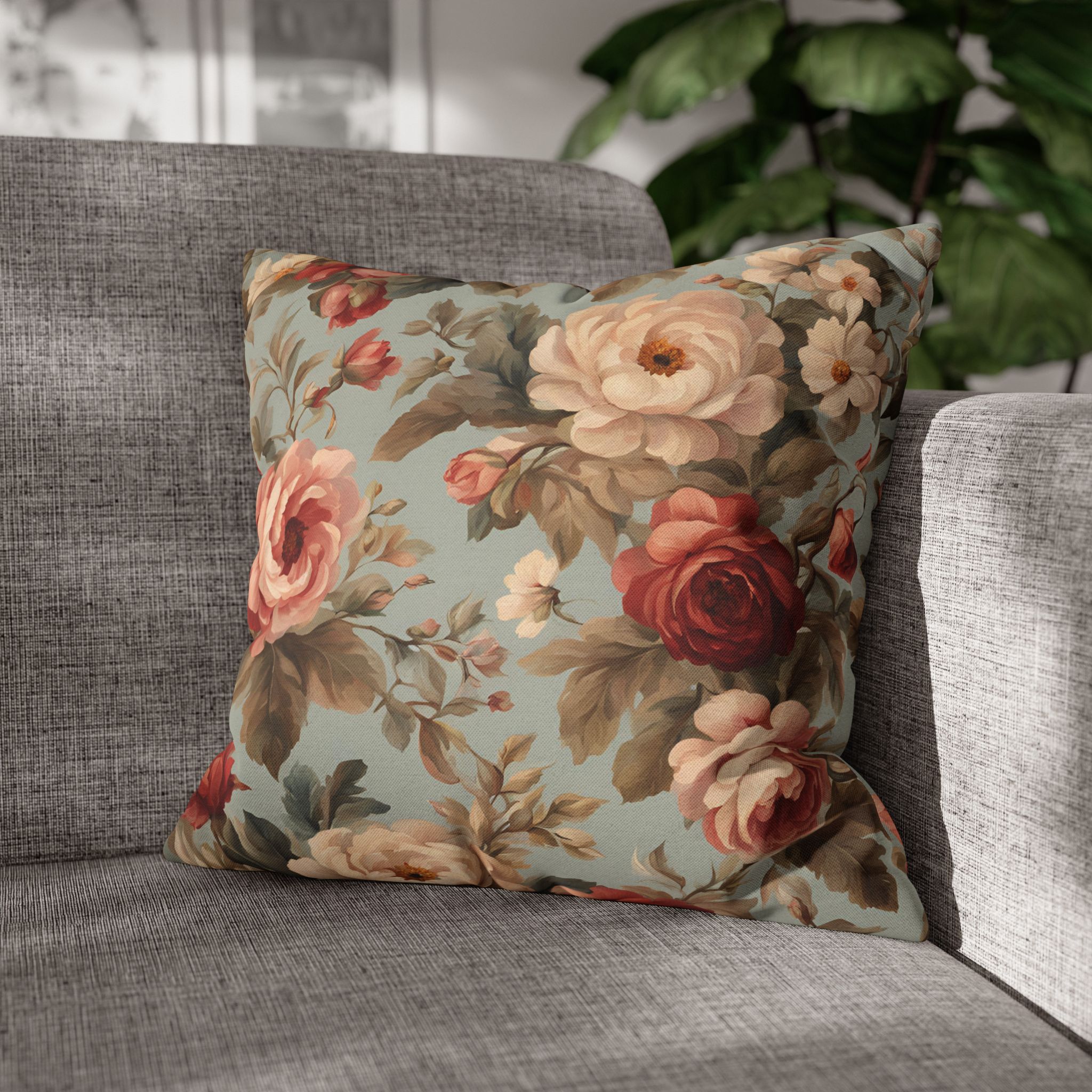
Pale florals are not the problem; washed-out pale florals are. These keep a definite ground color rather than drifting toward off-white, which is what stops them looking dated.
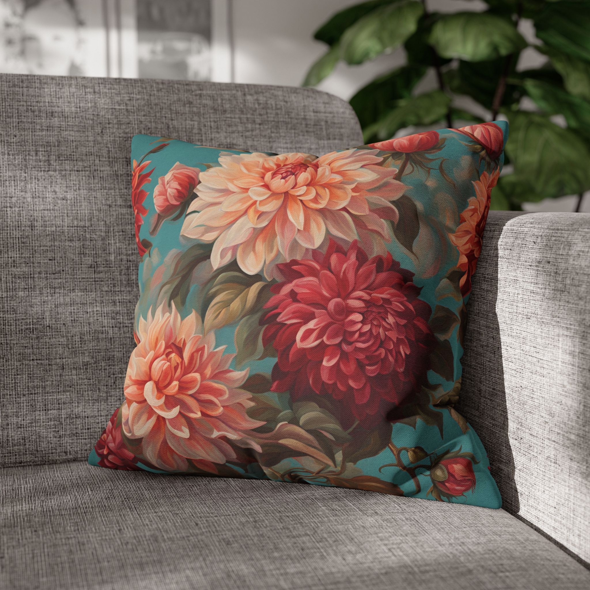
- Chintz Roses on Sage Mint is the most traditional pattern in the range on the least traditional ground.
- Peach Roses on Sage Green pairs two soft colors without either going gray.
- Apricot Magnolia on Grey is the one that will suit an existing gray sofa without any further thought.
What to put next to a floral
Two florals side by side almost never works — the eye cannot decide which is the subject. The reliable partner is a pattern with direction but no subject: a stripe or a check, pulled from a color already inside the floral.
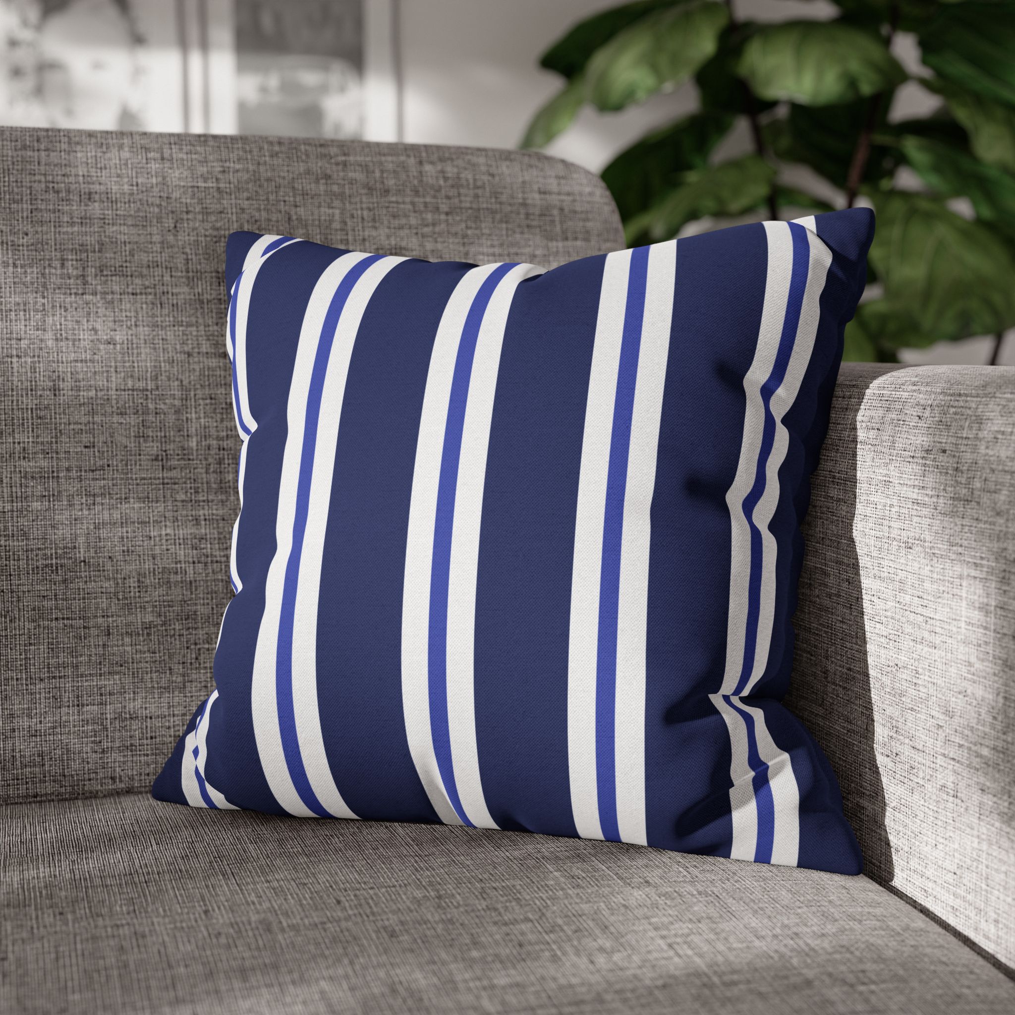
- With the teal grounds — Two Tone Blue Stripe.
- With the sage and mint grounds — Green & Yellow Stripe.
- With umber, charcoal and forest — Rectangle Check — Red & Pink, which picks up the bloom rather than the ground.
Three covers, one of them floral, one striped or checked, one quiet. That is the whole formula, and it is the same one behind mixing and matching like a designer.
Vintage floral pillow covers or pillowcases?
Many people search for vintage floral pillowcases when what they want is a floral cover for a sofa or accent pillow. The two are not the same thing. A pillowcase is the open-ended, rectangular sleeve that goes on a bed pillow you sleep on. A pillow cover is a square, decorative cover that zips around a throw pillow insert.
Every Oh My PillowCase floral is a square throw pillow cover with a concealed zipper, printed on both sides and available in seven sizes from 14×14 to 28×28 inches. The insert is not included. If you want the vintage floral look on a bed, use them as the decorative squares in front of your sleeping pillows rather than as the pillowcases themselves.
One honest note about the printing
These are printed designs — the painterly quality is in the artwork, not in the weave. Nothing here is embroidered, woven or hand-blocked, and we would rather say so than let the word “vintage” imply otherwise. Covers only, no insert, printed both sides with a hidden zip, made to order from 14″ to 28″.
If you are working around an existing sofa color, the beige, green and blue guides all include floral options in context. The full range is in our style collections.
Frequently asked questions
Are vintage floral pillow covers still in style?
Yes, but the look has shifted. Painterly flowers on darker or more saturated grounds read as current, while pale, faded chintz on cream can look dated unless the rest of the room is quite modern.
Can I use a floral pillow cover as a bed pillowcase?
Not as a sleeping pillowcase. These are square decorative covers for throw pillow inserts, so they work best as accent pillows on a bed, sofa, armchair or window seat.
What goes with a vintage floral pillow?
A plain linen-texture cover in one of the floral’s background colors, or a stripe or small check that picks up one color from the flowers. Keep the second pattern smaller in scale so the floral stays the focus.
How do I wash a printed floral cover?
Remove the insert, pre-treat any marks gently, then machine wash at no more than 40°C / 104°F on a gentle cycle. Do not bleach or tumble dry; air dry and iron or steam on low heat if needed. The same guidance is in our FAQ.