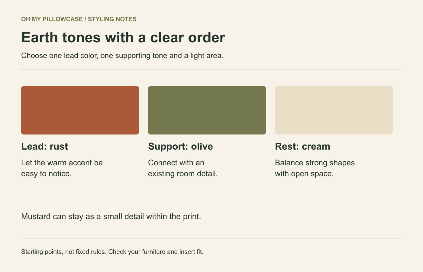
Boho pillow covers are easier to combine when one earth tone leads and the others appear in smaller amounts. Start with the sofa color, choose a rust or olive direction, and use cream to keep the arrangement open. Broad arches, suns and geometric shapes can supply the pattern without filling every seat.
Choose a dominant earth tone
An earth-tone palette can include several strong colors. Rust, mustard and olive may all be muted compared with bright primary colors, but using equal amounts of each can still make a sofa busy. Decide which color you want to notice first.
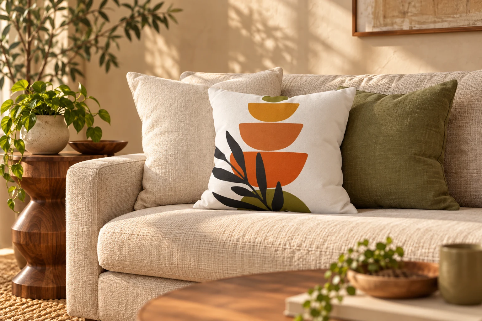
On an oatmeal sofa, rust gives a clear warm accent. On a cognac sofa, olive can create more distinction than another orange-brown shade. Against gray, cream areas help warm colors stand out without making the whole arrangement dark.
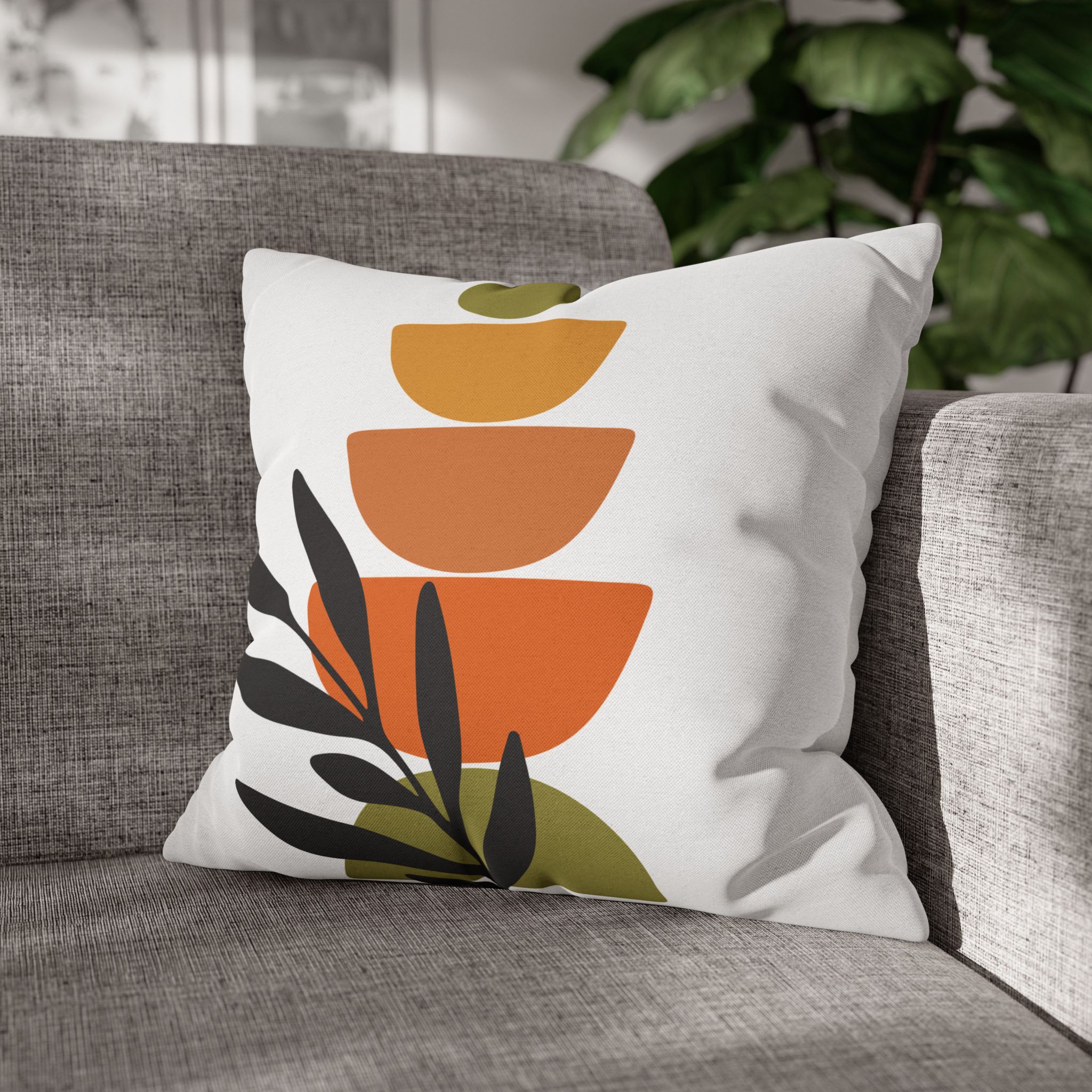
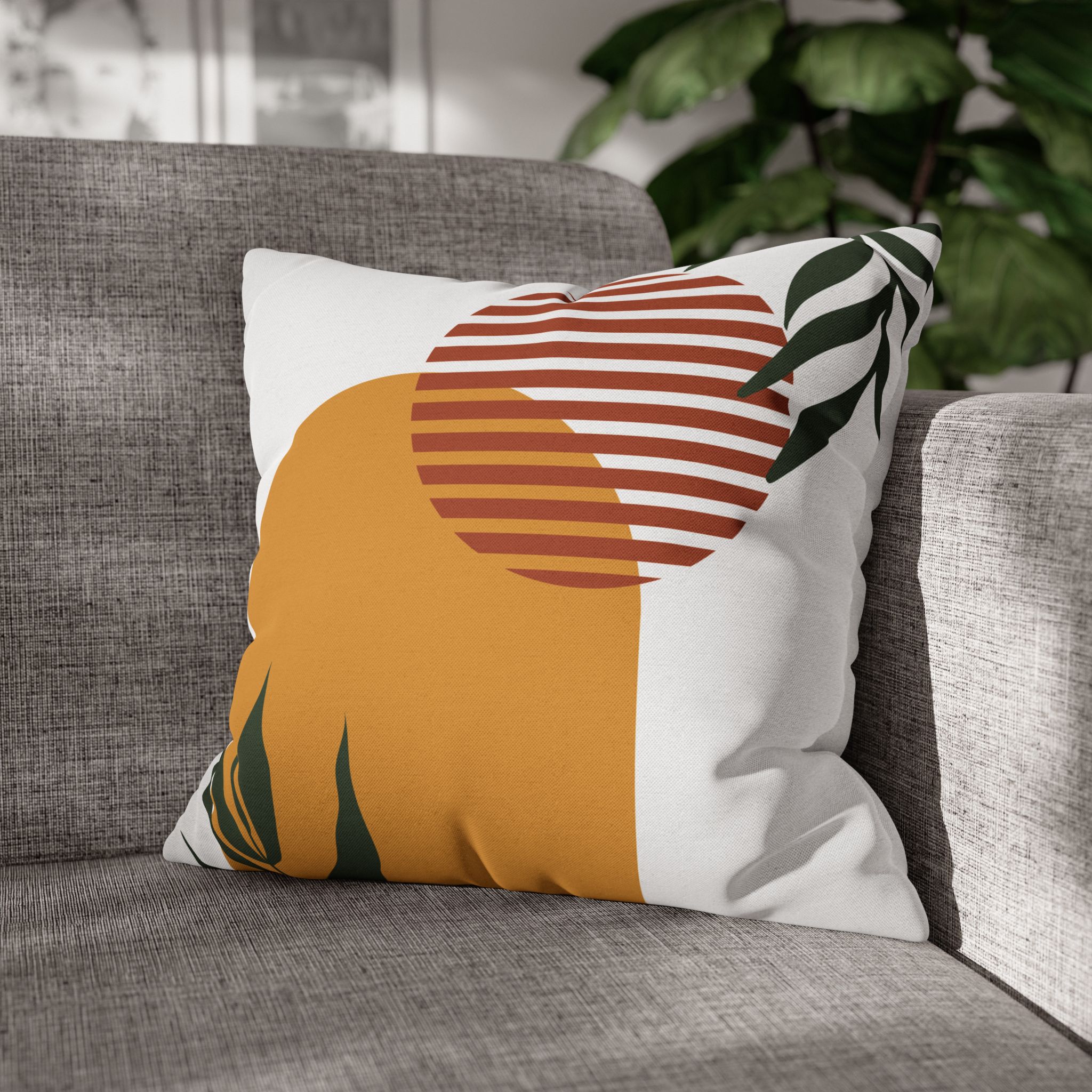
A terracotta, mustard and olive geometric design gives you several possible starting points. Choose one of those colors to repeat in the next pillow. Let the remaining colors stay within the original print instead of multiplying them across the room.
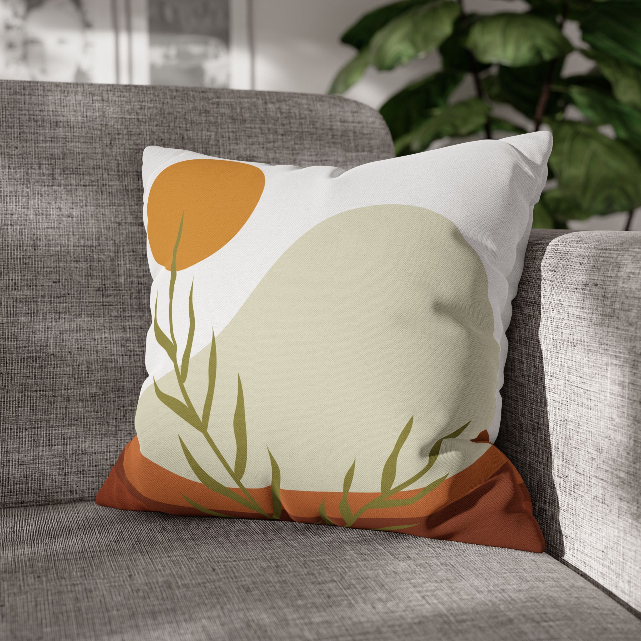
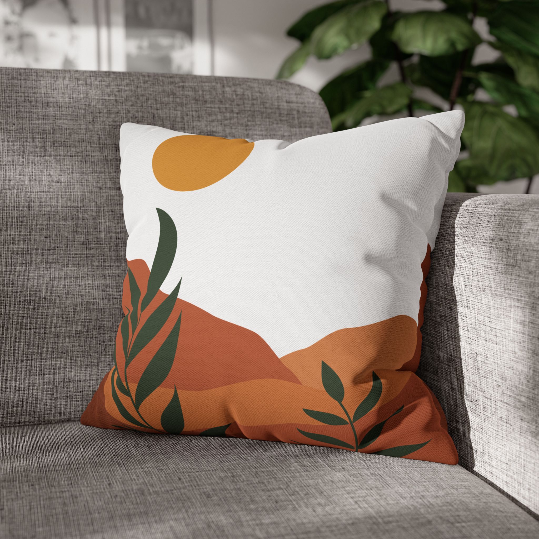
A landscape in beige, green and rust is another useful starting point. Its palette can connect pale upholstery with a plant or warm wooden furniture. Look for the broad relationship of light and dark before trying to match any one shade precisely.
Give arches, waves and suns different roles
Pattern mixing becomes easier when you compare shapes as well as colors. An arch has a clear direction. A wave carries movement across the surface. A sun creates a focal shape that the eye tends to return to.
Choose one of these jobs for the main pillow. If the sofa already has curved arms, a graphic arch might repeat that geometry. If the room contains many square frames and straight furniture edges, a wave can introduce a different rhythm.
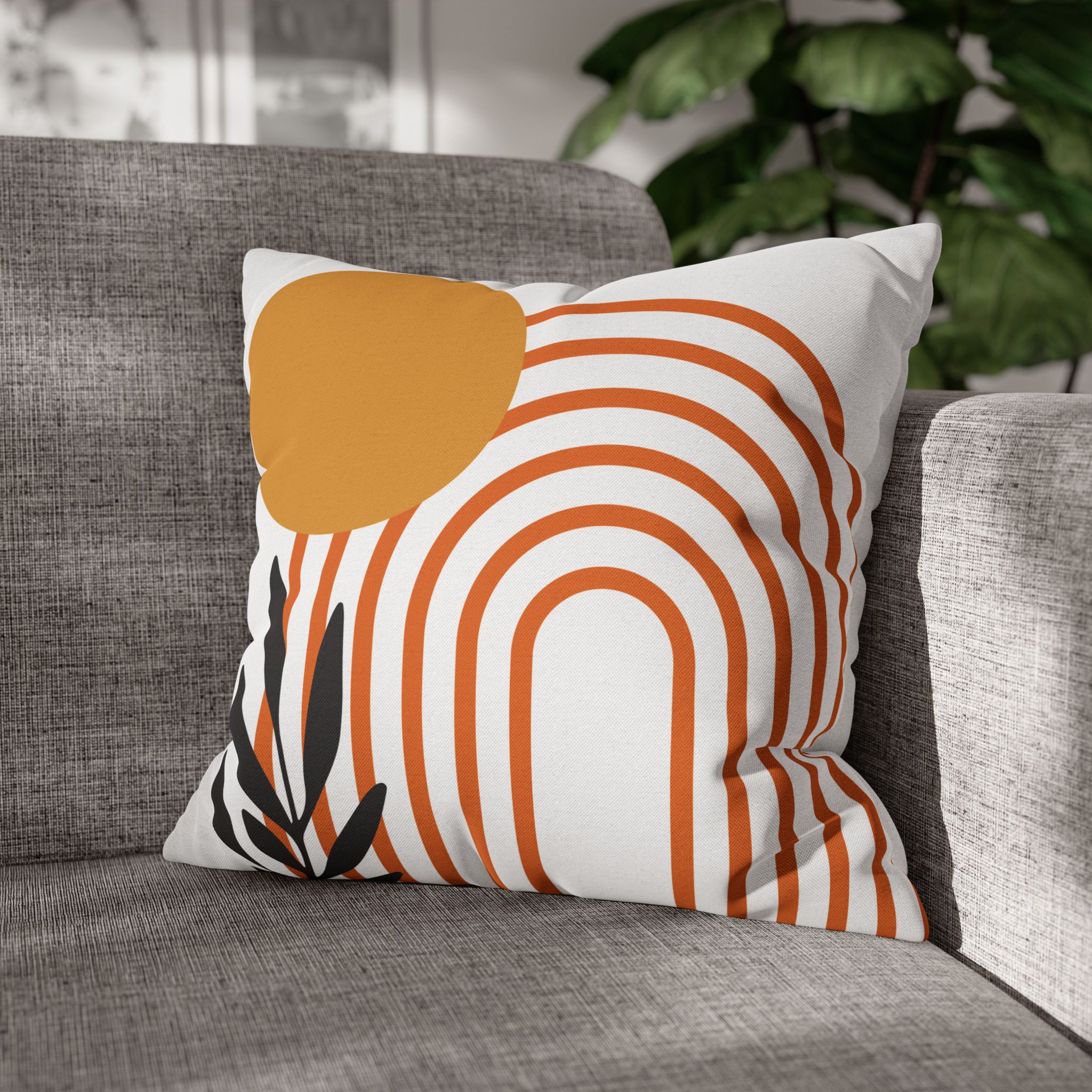
The terracotta line-art arch is an option when you want the arrangement to stay visually simple. Place it where the shape can be read as a whole rather than half hidden behind a larger cushion.
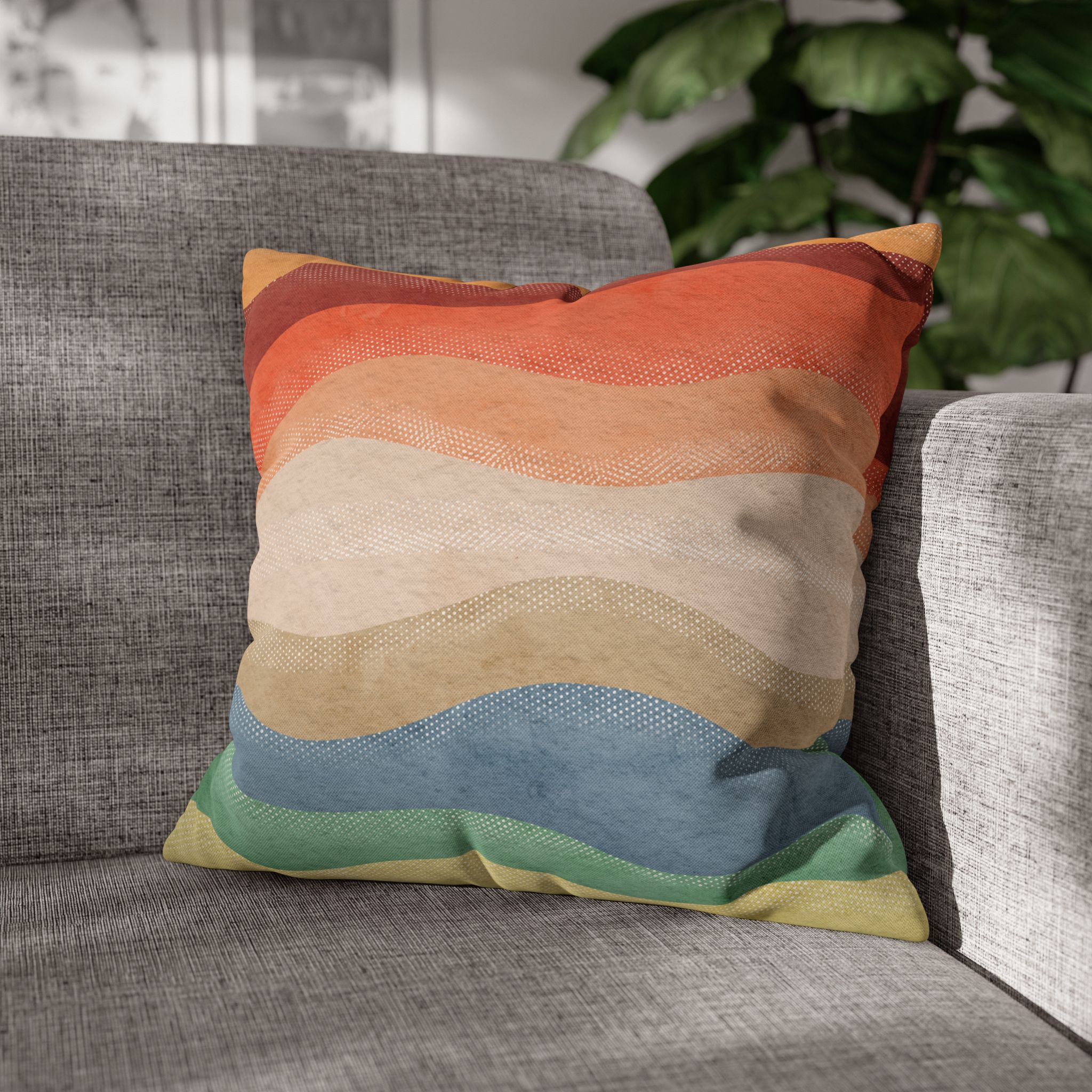
A rust-to-green wave pattern introduces several related colors through bands. Use it to connect a warm side of the room to a cooler green detail, such as an olive chair or existing throw.
Do not assume two patterns need the same background to belong together. A pale field beside a darker field can give the arrangement depth, provided a color or shape connects them. The change in contrast is often what makes each design easier to see.
Match the palette to the sofa
A neutral sofa is a useful background, but neutrals differ. Cream has a warmer starting point than cool gray. Brown leather already contributes a strong warm color. Green upholstery supplies part of the palette before you add a single pillow.
| Sofa color | Lead color | Supporting colors | What to watch |
|---|---|---|---|
| Cream or oatmeal | Rust | Olive and pale beige | Too many equally bright accents |
| Cool gray | Terracotta | Cream and restrained mustard | Dark prints disappearing against the sofa |
| Cognac | Olive | Cream and a small rust detail | Orange-brown colors merging |
| Dark green | Warm ocher | Pale beige and terracotta | Repeating green at the same depth |
Olive-and-rust geometric doorways can connect the first and third palettes. Use a lighter partner if both the sofa and the design read as dark from across the room.
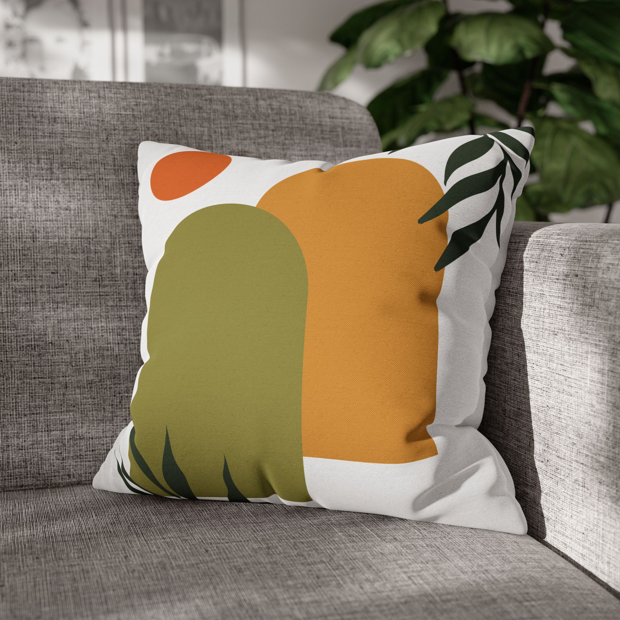
A desert-sun design in olive, rust and gold suits a room where the warm accent needs to be visible. Let it be the focal pillow and keep the neighboring print simpler, or use an existing plain cushion.
If your sofa is green, the green sofa styling guide offers additional starting points. Choose the undertone that resembles your upholstery rather than treating every green as interchangeable.
Use cream and open space deliberately
A quieter area can come from a pale pillow, a plain throw or the sofa itself. You do not have to purchase another cover just to make a pause. Leave a seat clear between two strong prints and see whether that resolves the arrangement.
For three pillows, try a 20-inch anchor near one arm, an 18-inch supporting design in front, and an 18-inch accent at the other end. These sizes are a starting point. A small loveseat may need only two, while a deep sectional may accommodate a larger anchor.
An abstract sun with olive and orange can repeat the palette without repeating an arch. Choose it because you need a different focal shape, not because every earth-tone design must appear together.
A mint-and-terracotta horizon introduces a cooler note. That can be helpful in a room already filled with warm wood and brown upholstery. Keep the mint as a small connection rather than adding several unrelated blue-green accessories.
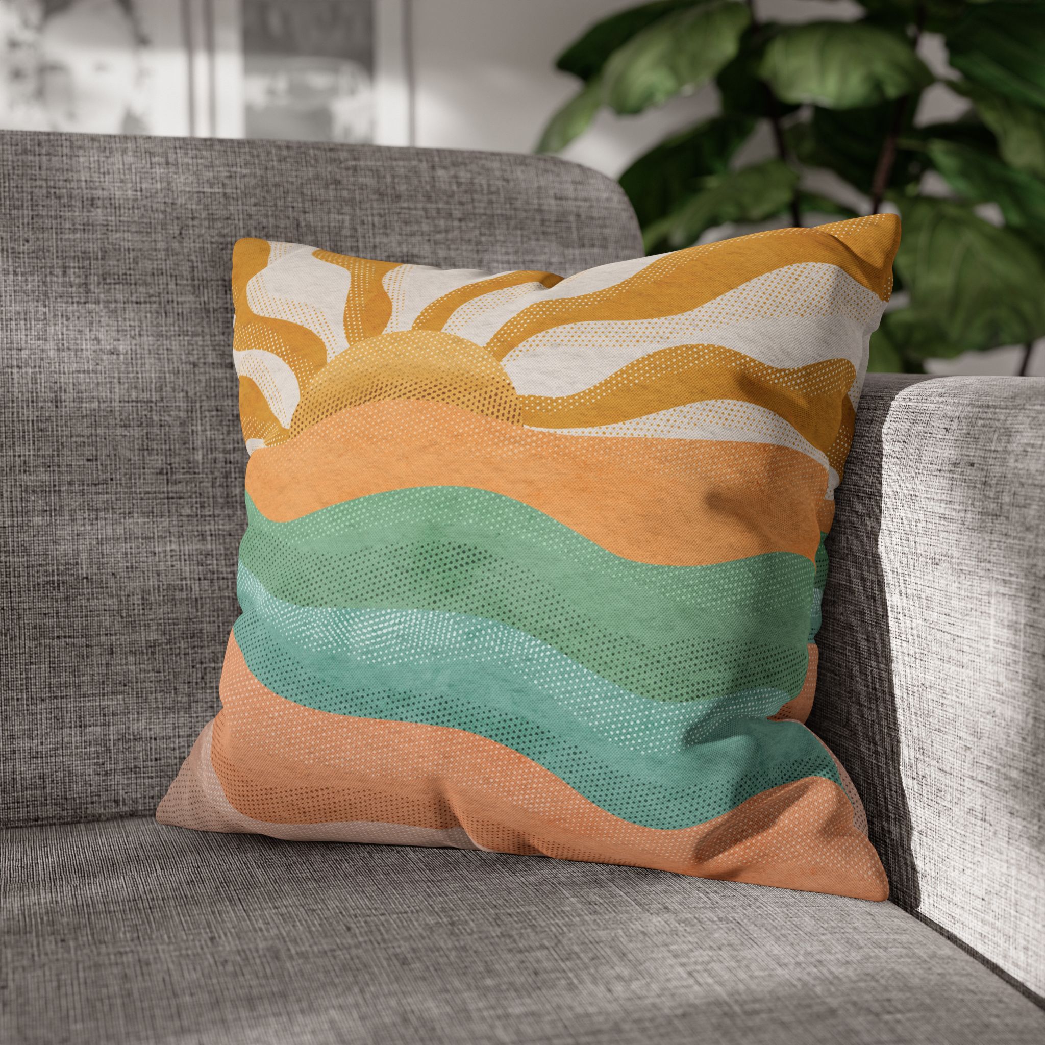
When you test the layout, sit in your usual place. A pillow that looks balanced but blocks an armrest or forces you forward is in the wrong position. Move it before deciding that its color is the problem.
Connect the pillows to the rest of the living room
Take one color out of the sofa arrangement and repeat it once nearby. A green plant can support olive. A clay-colored bowl can support rust. The connection does not need to be exact, and objects should still earn their place through use or personal meaning.
Avoid filling the room with decorative items simply because they are labeled boho. The useful elements here are the palette, the shapes and the way they relate to your furniture. A simple room can carry the same colors as a more layered one.
Photograph the sofa in daylight and again under the lamps you normally use. Warm evening light can change the apparent relationship between mustard, rust and cream. If two colors merge at night, separate them with a lighter area or move one print elsewhere.
The covers are printed on both sides of 100% polyester and have concealed zippers. Their geometric designs do not imply embroidery or woven texture. They are made to order in seven square sizes, and the pillow insert is not included.
Frequently asked questions
What colors go with boho pillow covers?
Olive, rust, mustard, terracotta and cream can work together when one color leads. Start with a shade already present in your sofa, rug or artwork and add a supporting color gradually.
Do boho pillows have to be mismatched?
No, matching pairs can work, especially on a symmetrical sofa or bed. You can also vary the pattern while repeating a color to create a less formal arrangement.
How do I keep earth-tone pillows from looking dull?
Include a visible difference between light and dark, such as cream beside rust or olive. If every color has the same depth, change the contrast before adding more patterns.
Explore the earth-tone designs in boho pillow covers.