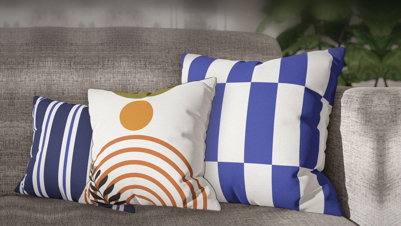
A gray sofa is easy to buy and surprisingly hard to style. Beige forgives almost anything. Gray does not. It is a cool neutral, and cool neutrals push back against about half the colors you might put on them.
The good news is that the difficulty is predictable. Once you know which gray you actually own, the choice narrows from “everything” to about three sensible directions.
First, find out which gray you have
Hold a sheet of printer paper against the seat cushion in daylight. Against true white, the undertone gives itself away immediately:
- Blue-gray. The sofa looks faintly slate or steel next to the paper. This is the coolest of the three and the least forgiving of muddy colors.
- Greige. The sofa looks slightly brown or sandy. It behaves more like a beige sofa than a gray one, and warm colors land easily on it.
- True charcoal. Dark enough that undertone barely matters. What matters instead is value — anything dark disappears against it.
Almost every styling mistake on a gray sofa comes from treating all three as one color.
The mistake: answering gray with more gray
The instinct is to reach for gray-and-white covers, because they are guaranteed not to clash. They are also guaranteed not to do anything. Gray upholstery already occupies the middle of the value range; adding more mid-tone gray gives the eye nothing to land on, and the whole arrangement reads as one soft mass with a faint pattern on it.
A gray sofa does not need a safer neutral. It needs either warmth or contrast — and it is worth deciding which before you buy anything.
Route one — warm it up
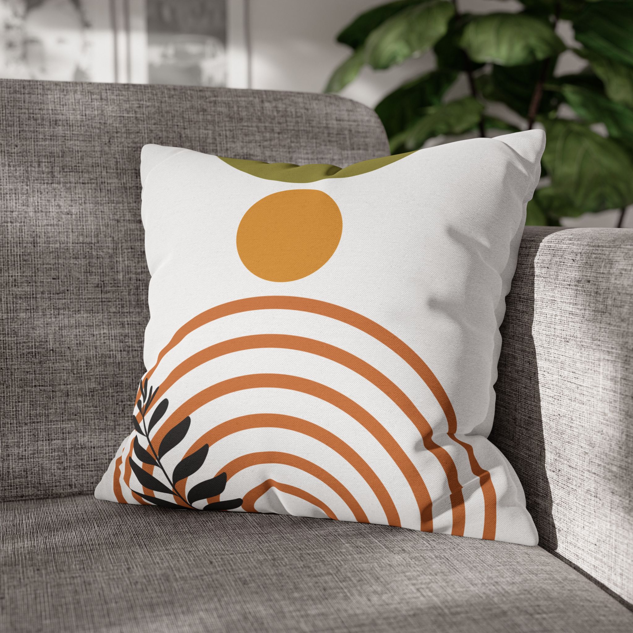
This is the direction that fixes the most rooms. Gray reads cold in plenty of rooms, particularly north-facing ones, and a warm accent corrects the temperature rather than fighting it. Rust, terracotta, ochre and mustard all sit opposite gray on the temperature axis, which is exactly why they look deliberate rather than accidental.
- Boho Sun Arch — Mustard & Terracotta carries two warm tones at once, so a single cover does the work of two.
- Desert Sun — Olive, Rust & Gold brings olive along with the warmth, which keeps it from tipping into pure orange.
- Boho Arch — Terracotta is the quiet one of the group: warm, but line-drawn rather than saturated.
On a blue-gray sofa this route is close to foolproof, because the warm accent and the cool upholstery are doing genuinely different jobs.
Route two — stay cool, but change the value
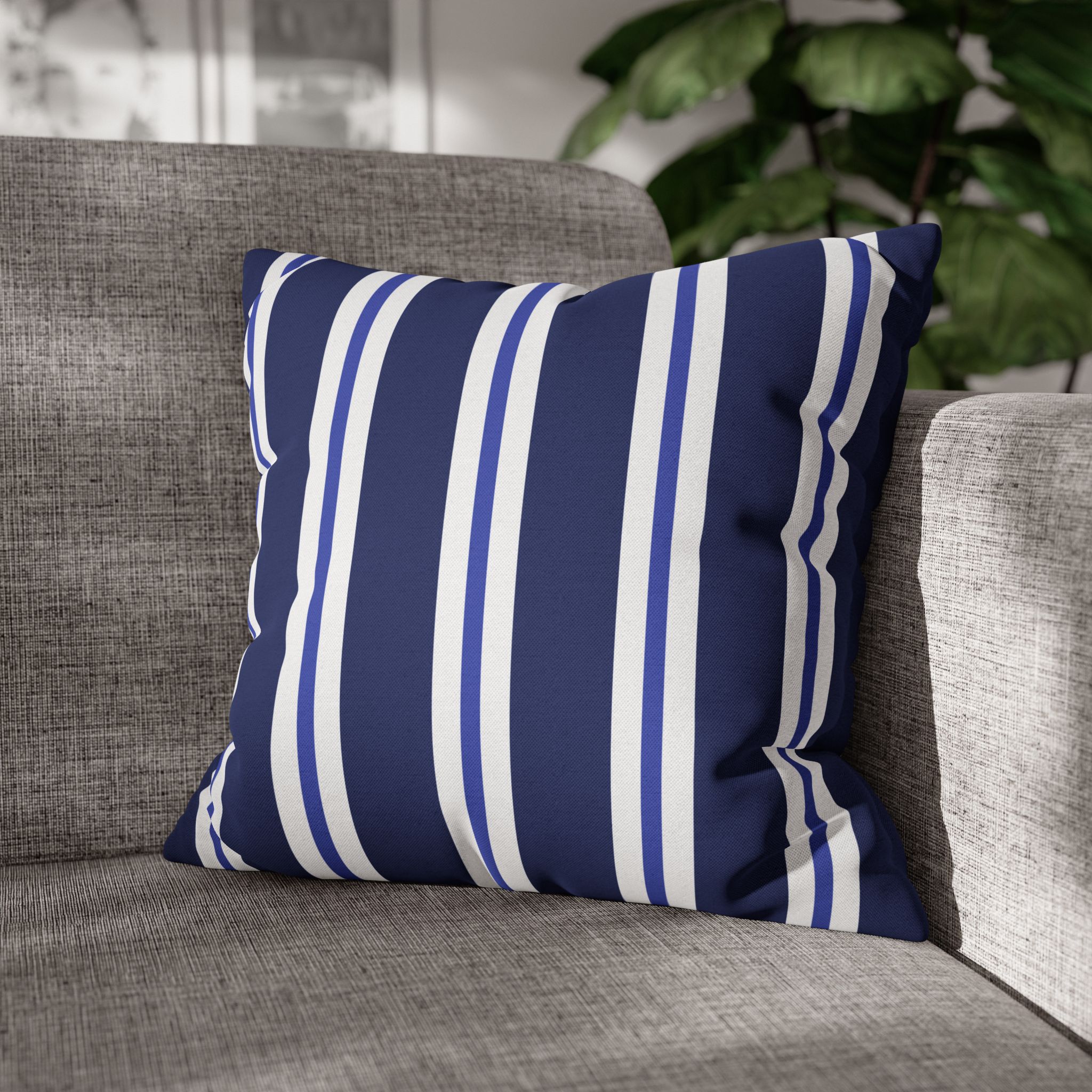
If you like the coolness and want to keep it, the fix is not temperature but depth. Go darker and more saturated than the sofa, so the covers read as objects rather than as more upholstery.
- Two Tone Blue Stripe — Navy is the anchor: dark enough to hold a corner of the sofa on its own.
- Vintage Bloom — Coral Dahlias on Teal keeps the cool base but smuggles a warm coral into the pattern, which stops the arrangement going flat.
- Vintage Bloom — Chintz Roses on Sage Mint is the softest of the three and works best as the third cover rather than the lead.
Route three — go graphic
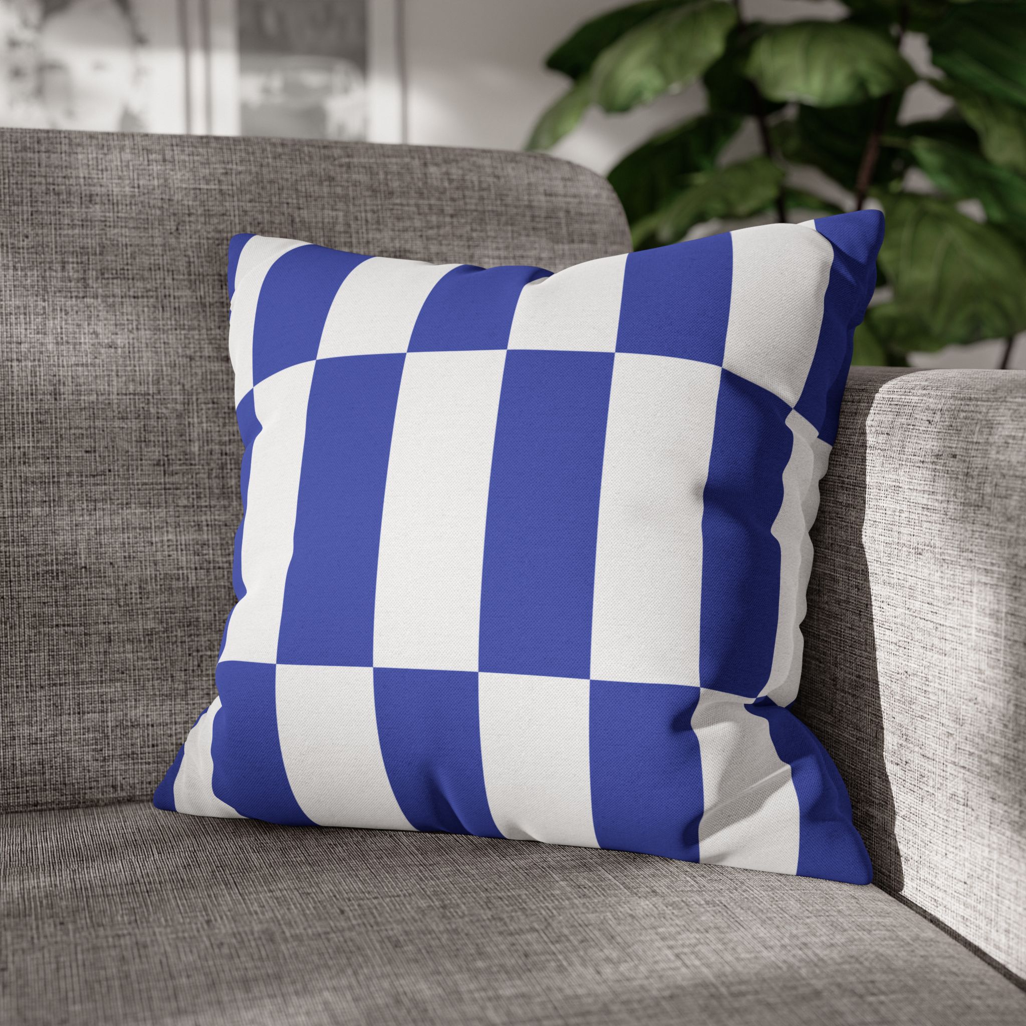
On charcoal in particular, color matters less than pattern. A dark sofa flattens saturated color at any distance, so the thing that survives across a room is high-contrast geometry.
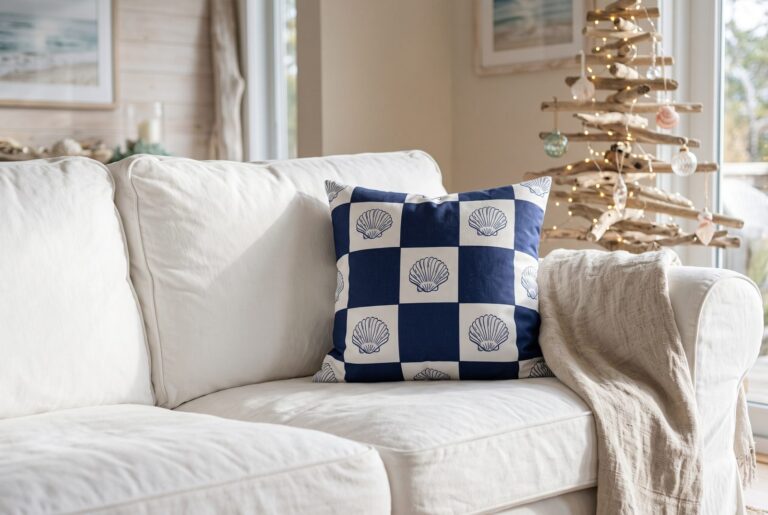
- Oversized Check — Blue & White reads clearly from across a room, which smaller patterns will not do against charcoal.
- Oversized Check — Bright Yellow is the highest-contrast option here and works as a single accent rather than a pair.
- Blue Awning Stripe gives you direction without a motif, which is useful when something else in the room is already busy.
One thing worth saying about these photographs
Most of the product images on this site show the cover on a light gray sofa. For every other article we write, that is a limitation we have to talk around. For this one it is simply accurate: if you have a gray sofa, the product photograph is showing you close to what you will actually get, rather than an approximation you have to mentally recolor.
Sizes, and what you are actually buying
These are covers only — no insert included, printed on both sides with a hidden zip, and made to order in sizes from 14″ to 28″. Buying the cover rather than the whole pillow is what makes a seasonal change cheap: the set you are not using folds flat in a drawer instead of taking up a shelf.
Standard sofas take 18″ or 20″ covers comfortably. If you are unsure, our size guide covers the one-inch rule and why a cover slightly smaller than the insert looks better than one that matches exactly.
A warmer option: rug patterns and earth tones
Gray is a cool neutral, so warm reds and rust give it the contrast it lacks. A rug-inspired medallion in madder red reads clearly against light and mid gray, and an earth-tone geometric in terracotta, mustard and olive can sit beside it as the calmer partner. Keep one plain cushion between them so the two patterns do not compete.
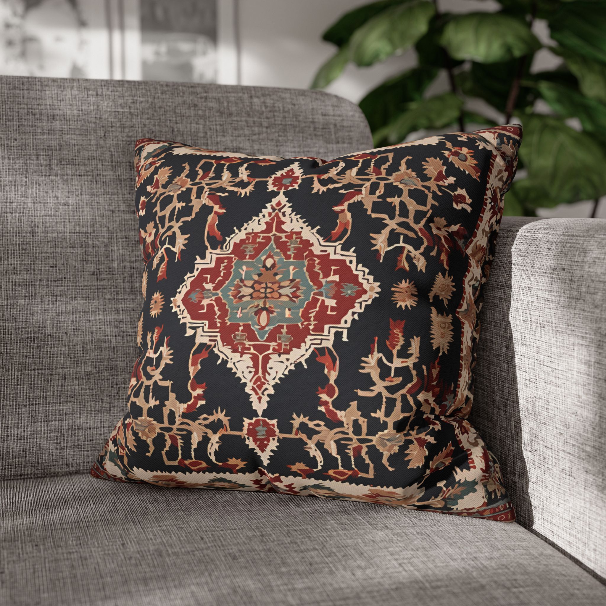
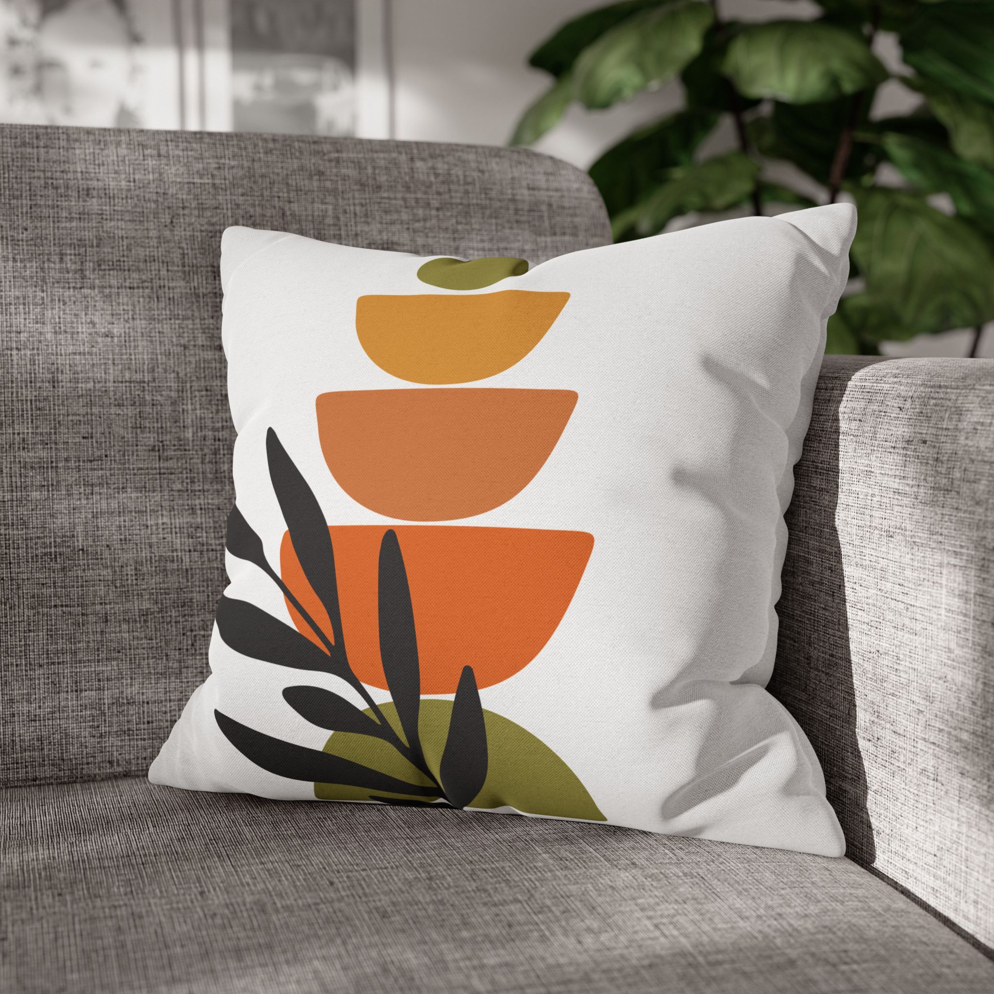
See the full kilim pillow covers and boho pillow covers collections.
If your sofa is not gray
The same diagnostic approach applies, but the answers change. We have written the equivalent guides for a beige or cream sofa, a blue sofa and a green sofa. If you want the underlying method rather than a color answer, how to mix and match pillow covers explains the scale-and-role logic all of these guides are built on.
Or start from the designs themselves and work backward — the full range is organized by motif in our style collections.