Stripes and checks are both having a moment, and putting them in the same room is the fastest way to make it look like a picnic blanket. It is also, done properly, the most reliable pattern combination in decorating — the one that works when florals and geometrics have both failed.
The difference between the two outcomes comes down to a single variable.
The rule: separate them by scale, not by color
Most people try to make a stripe and a check coexist by giving them different colors. That is the wrong lever, and it usually makes things worse — now you have two patterns and two palettes competing.
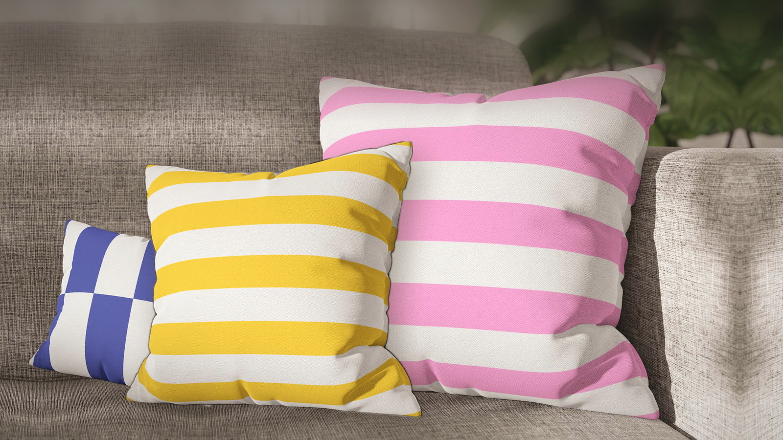
The lever that actually works is scale. Put a fine stripe next to a large check, or a broad stripe next to a small check, and the eye instantly reads one as the pattern and the other as texture. Keep them at similar scale — a medium stripe beside a medium check — and they fight, regardless of how well the colors go together.
Once the scales are clearly different, sharing a palette stops being a risk and becomes the thing that makes the pair look intentional.
Broad stripe plus small check
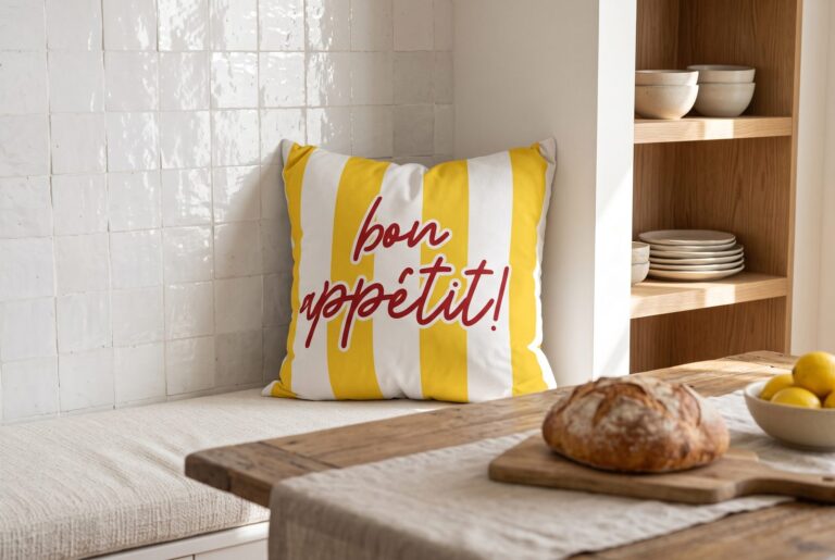
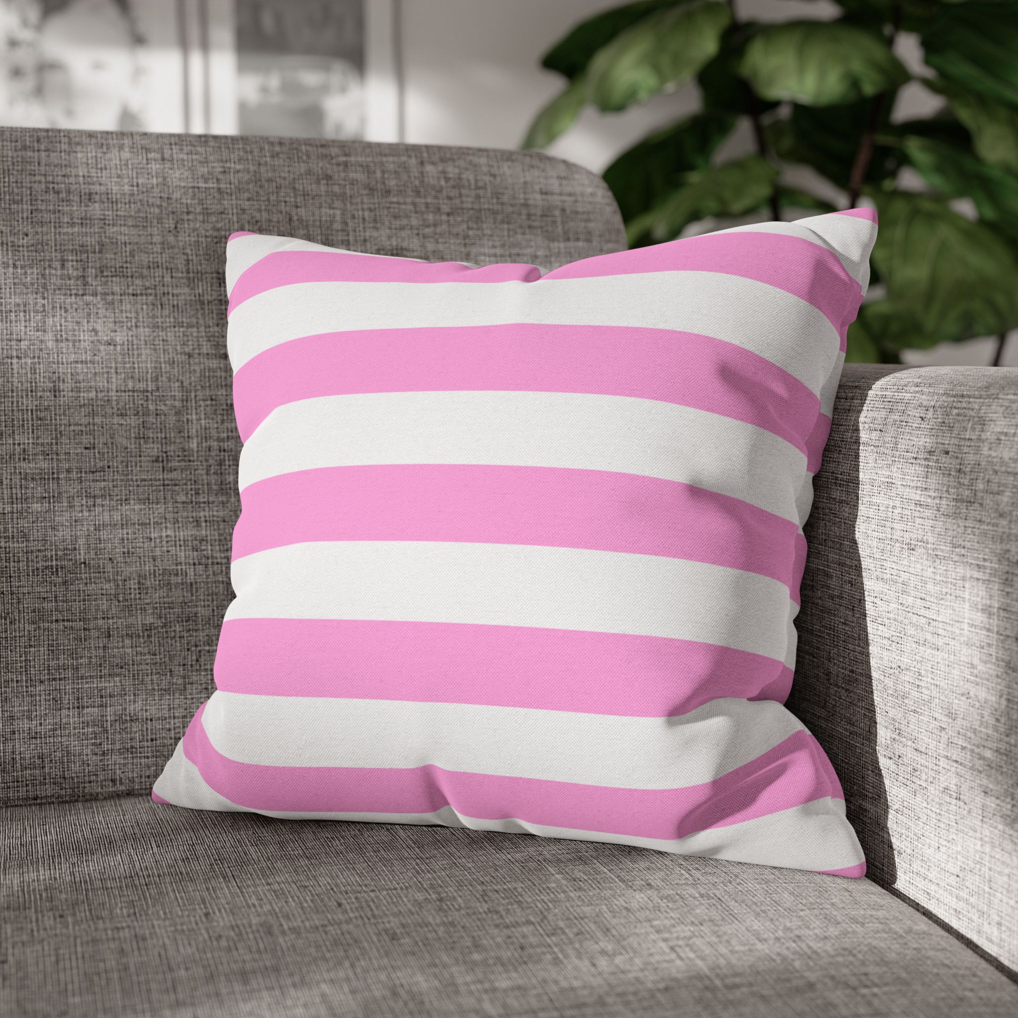
The wide awning stripes — yellow, pink and blue — are the broadest in the range, which makes them the natural partner for a tighter check. This is the combination that reads as deckchair-and-tablecloth in the good sense.
- Pink Awning Stripe with Rectangle Check — Red & Pink: one palette, two scales, no argument.
- Yellow Awning Stripe with Rectangle Check — Warm Yellow is the same idea in a warmer register.
- Blue Awning Stripe with Rectangle Check — Blue & White is the most classic pairing of the three and the hardest to get wrong.
Fine stripe plus oversized check
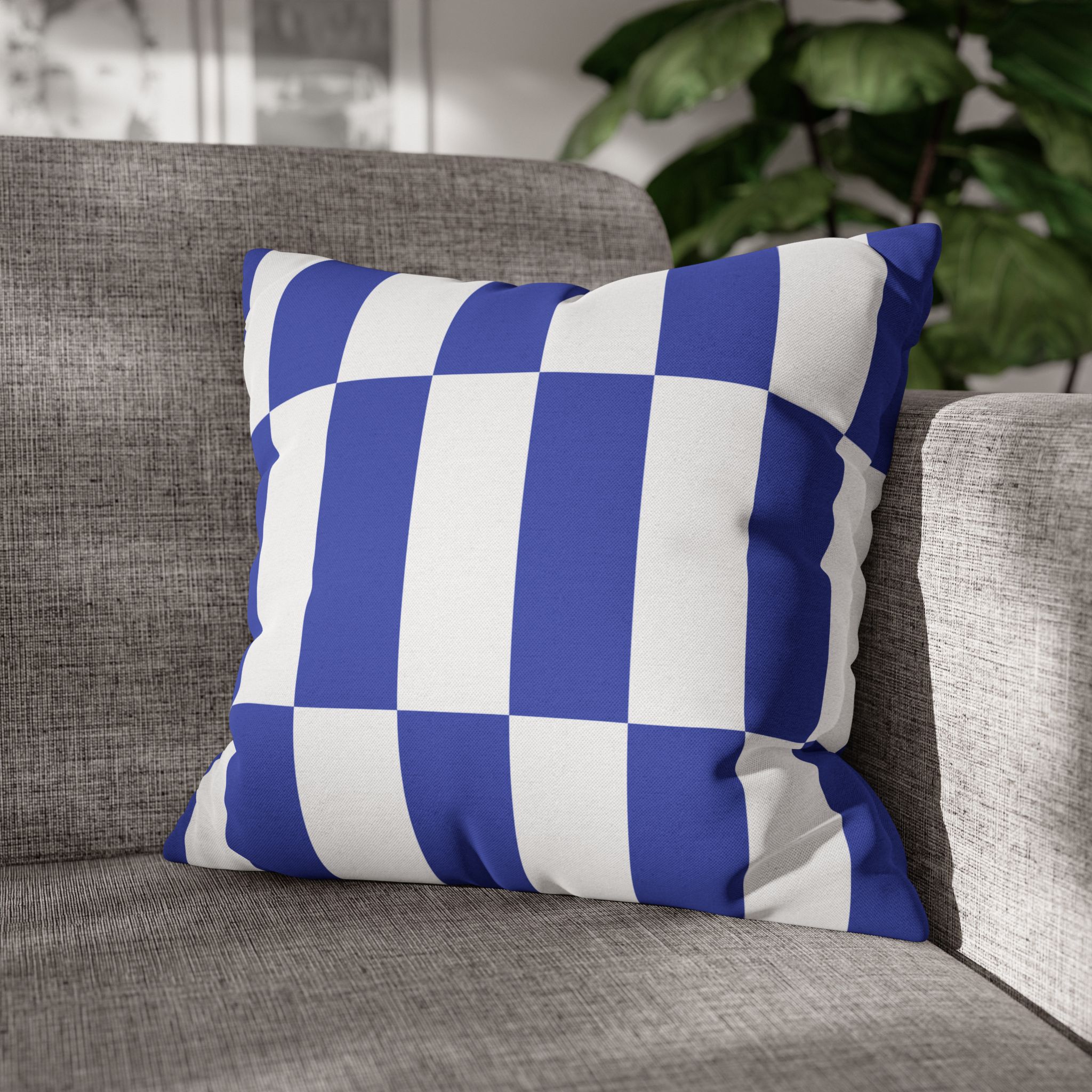
Reverse the relationship and the mood changes completely. A large check becomes the statement and the fine stripe recedes into texture — this is the more modern of the two arrangements, and the better one for a room that is otherwise plain.
- Oversized Check — Blue & White with Two Tone Blue Stripe.
- Oversized Check — Soft Pink & White with Red Awning Stripe, whose stripe is much finer than the name suggests — which is exactly what makes the pairing work.
- Oversized Check — Bright Yellow is the loudest cover in the range and should be the only loud thing on the sofa.
When you want a third pattern
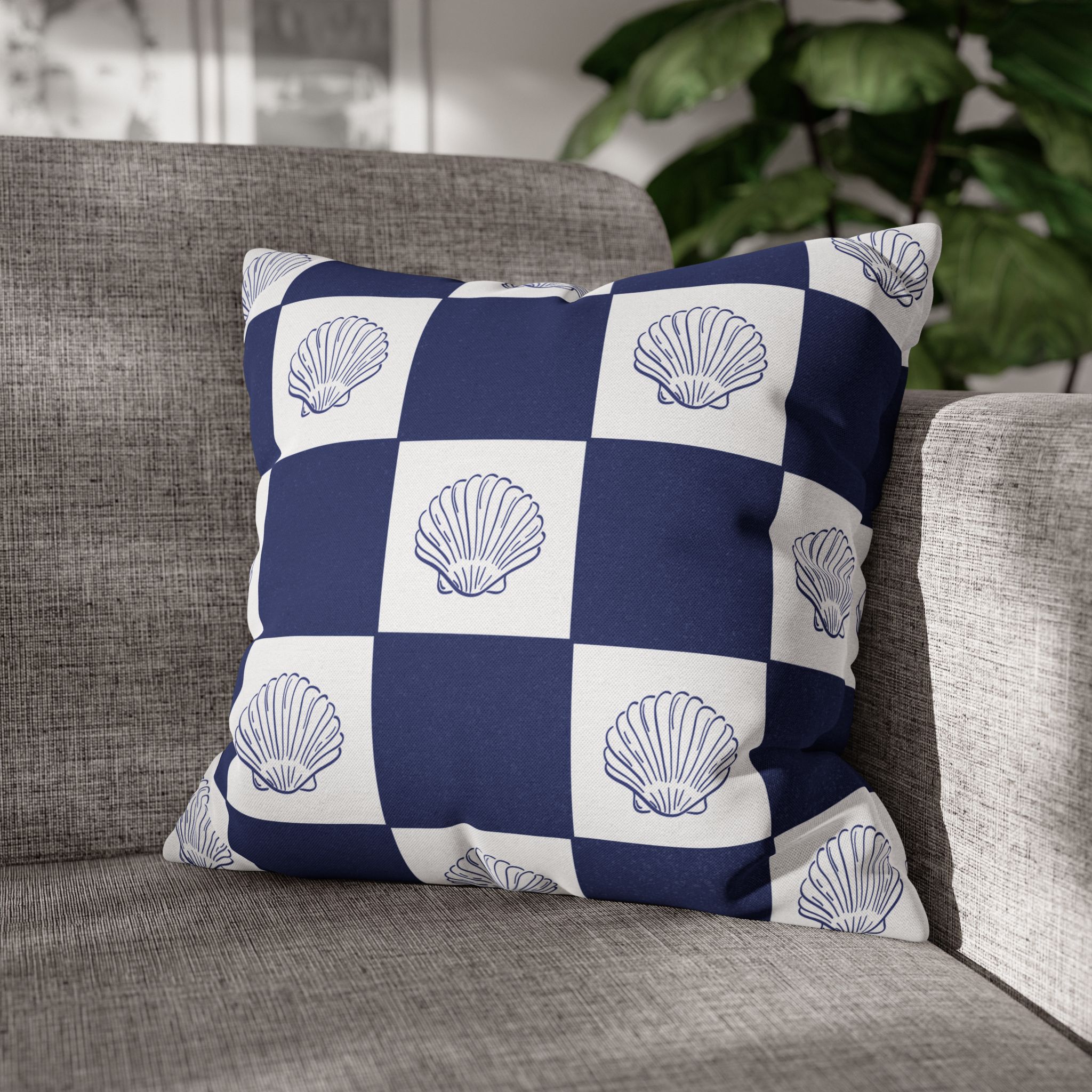
A stripe and a check leave room for exactly one motif, and it has to be at a scale neither of them occupies — usually a single large subject rather than a repeat.
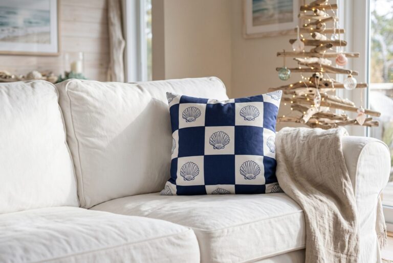
- Seashell — Navy Check and Seashell — Pink Check are useful here because the motif and the check are already resolved on one cover.
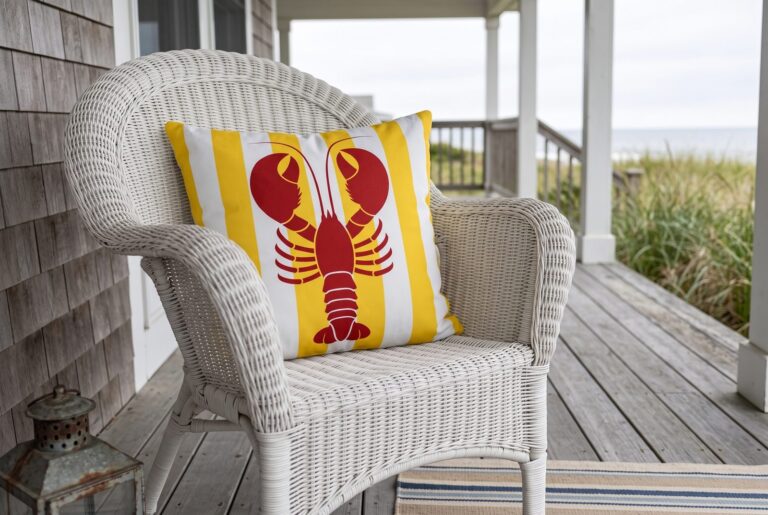
- Red Lobster — Blue Check does the same thing with a bolder subject.
- Watercolor Stripe — Soft Blue is the softest stripe in the range and the best one to put beside anything busy.
The Riviera version
If the whole scheme is going warm, the stripes shift from coastal to continental. Pink & Red Stripe and Green & Yellow Stripe are the two that carry that register on their own, and both take an oversized check happily.
Sizes and what you get
Scale contrast is easier if the covers are different sizes too. A 20″ check beside an 18″ stripe reinforces the hierarchy you have already set with the pattern. Sizes run 14″ to 28″; the size guide explains how to combine them on one sofa.
All covers only — no insert — printed both sides with a hidden zip and made to order.
Most of these designs also appear in coastal combinations, where stripes do a slightly different job. For the general principle behind all of it, see mixing and matching like a designer, or browse the full collections.