
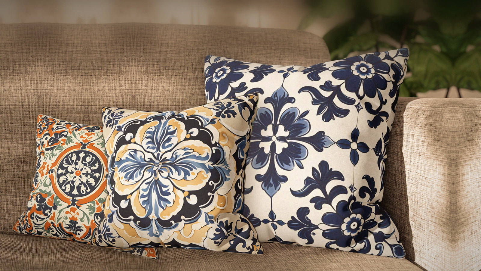
Azulejo is the reason a Lisbon street looks the way it does: entire facades tiled floor to roofline, patterns repeating across buildings that have nothing else in common. It is also, for most people, completely impractical. You are not going to tile a rented living room, and you probably should not tile an owned one either.
The good news is that azulejo was always a pattern language before it was a building material. It survives being moved onto textiles better than almost any other decorative tradition, because the thing that makes it work — a bordered, repeating, flat-color motif — is exactly what a pillow cover needs.
What azulejo actually is
Portugal borrowed blue-and-white tilework from Delft in the seventeenth century and never gave it back. What began as imitation became a national grammar, and then split in several directions at once: disciplined blue-and-white in the cities, looser polychrome work in country workshops, dense baroque panels in the great houses, and underneath all of it an older Moorish geometry that predates the Portuguese entirely.
Those four strands are still the most useful way to choose one. They behave differently in a room.
The blue-and-white discipline
Cobalt Azulejo is the orthodox version: cobalt on cream, no third color, a full repeat that runs off every edge as though the cover had been cut from a much larger tiled wall. That last detail is what makes it read as tile rather than as a printed square.
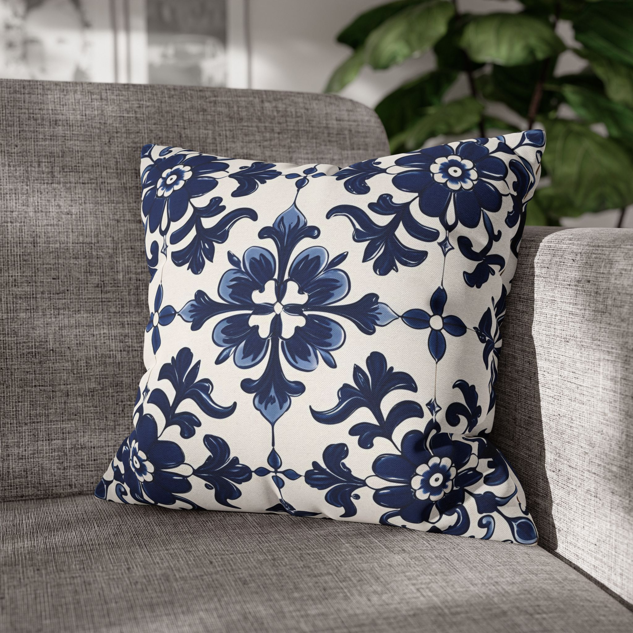
Blue and white goes with almost everything, which makes this the anchor to start from and add warmer tiles around. It is also the one to choose if you are nervous — it behaves like a neutral that happens to have a pattern.
When the workshops broke the rule
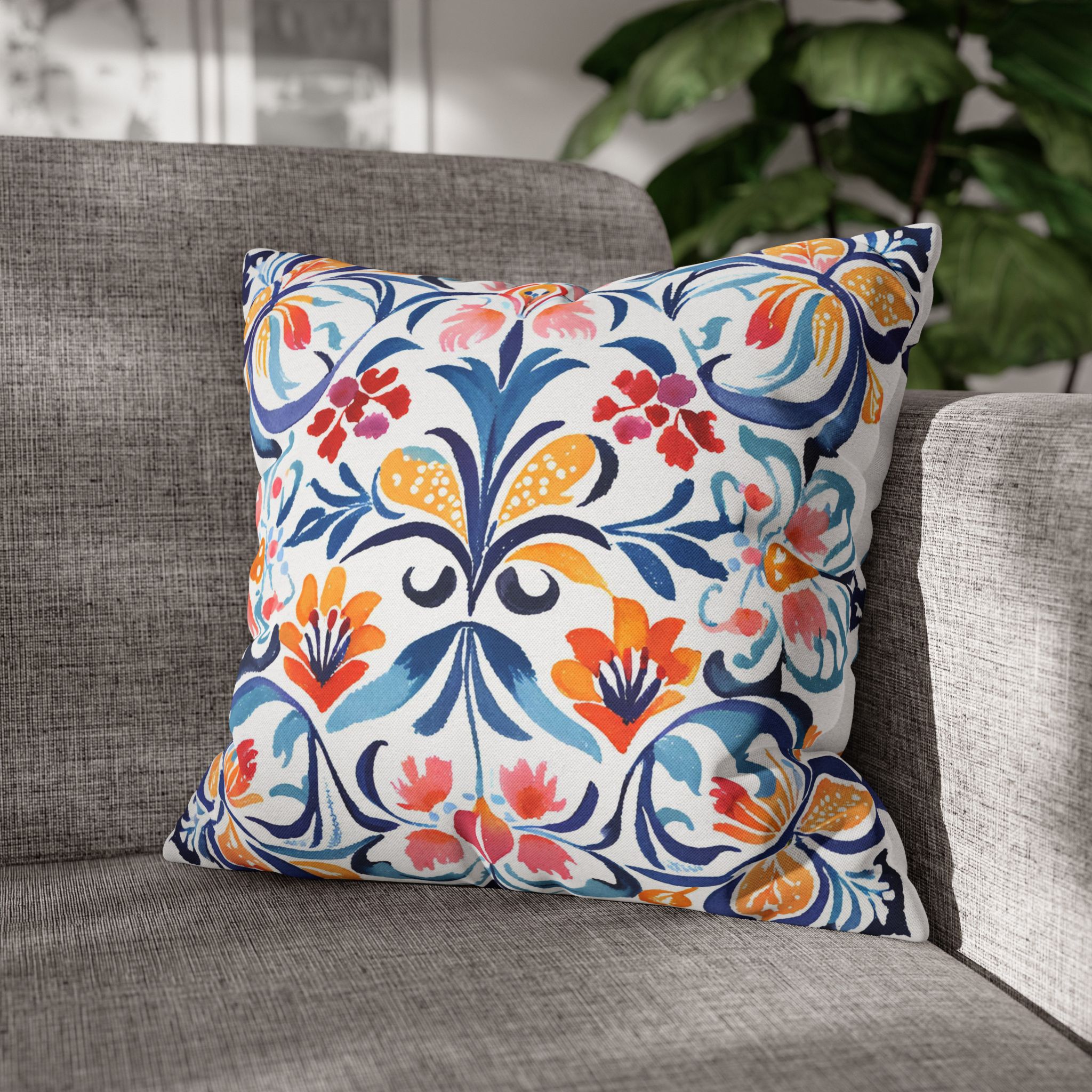
Not every Portuguese tile is blue and white. In the folk workshops of the interior, painters reached for whatever pigment was on the bench, and the results were louder and looser. Folk Floral Azulejo belongs to that tradition — symmetrical in structure but painted freely, cobalt against coral. Keep everything around it quiet and let it be the only pattern in the group.
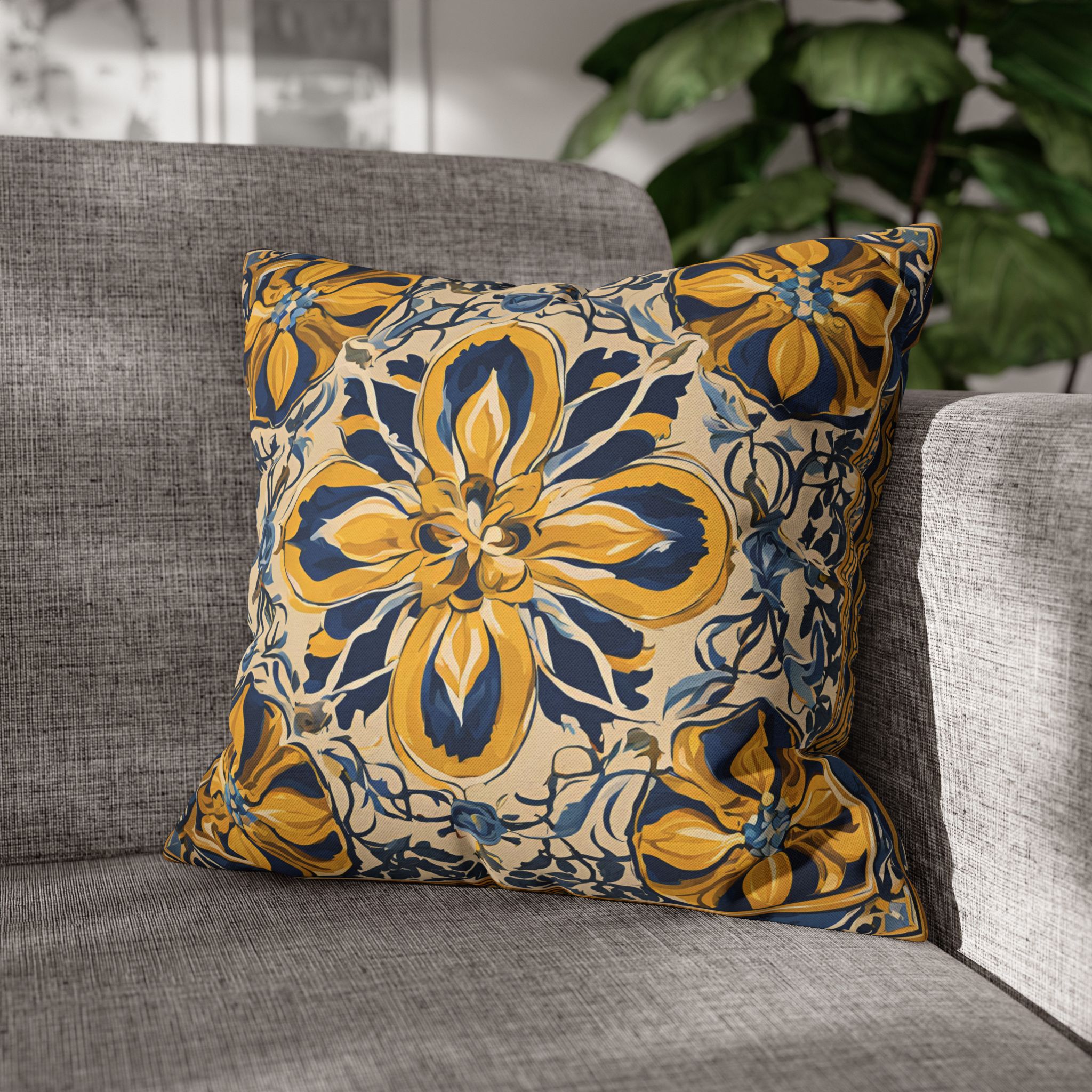
Saffron Azulejo comes from the same instinct, more controlled. Tile painters worked in cobalt for centuries before discovering that a single stroke of saffron makes the blue sing; here broad golden petals unfold across cream, held by inky navy foliage. Put it beside the Cobalt for the classic blue-and-gold pairing, or let it stand alone against oatmeal and raw wood.
The Moorish inheritance
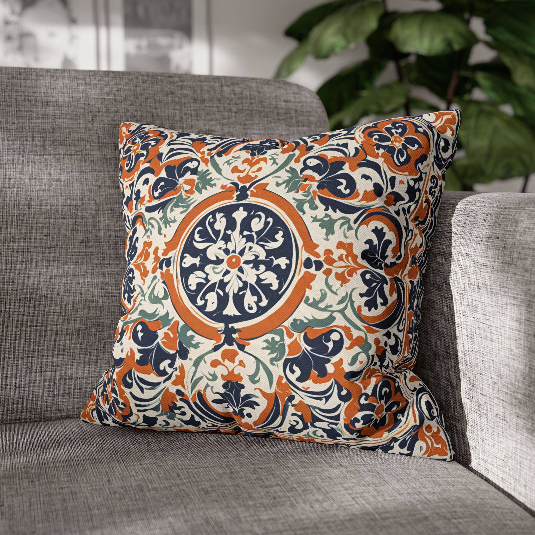
Rosette Azulejo reaches back past Portugal entirely. The rosette — a wheel of stylized petals — was carried across the Mediterranean by Moorish craftsmen and later made Portuguese. Drawn in deep navy inside a burnt-orange ring with sage foliage running to the corners, its three colors do the work for you: pull the navy with dark ceramics, the orange with terracotta pots, the sage with real greenery.
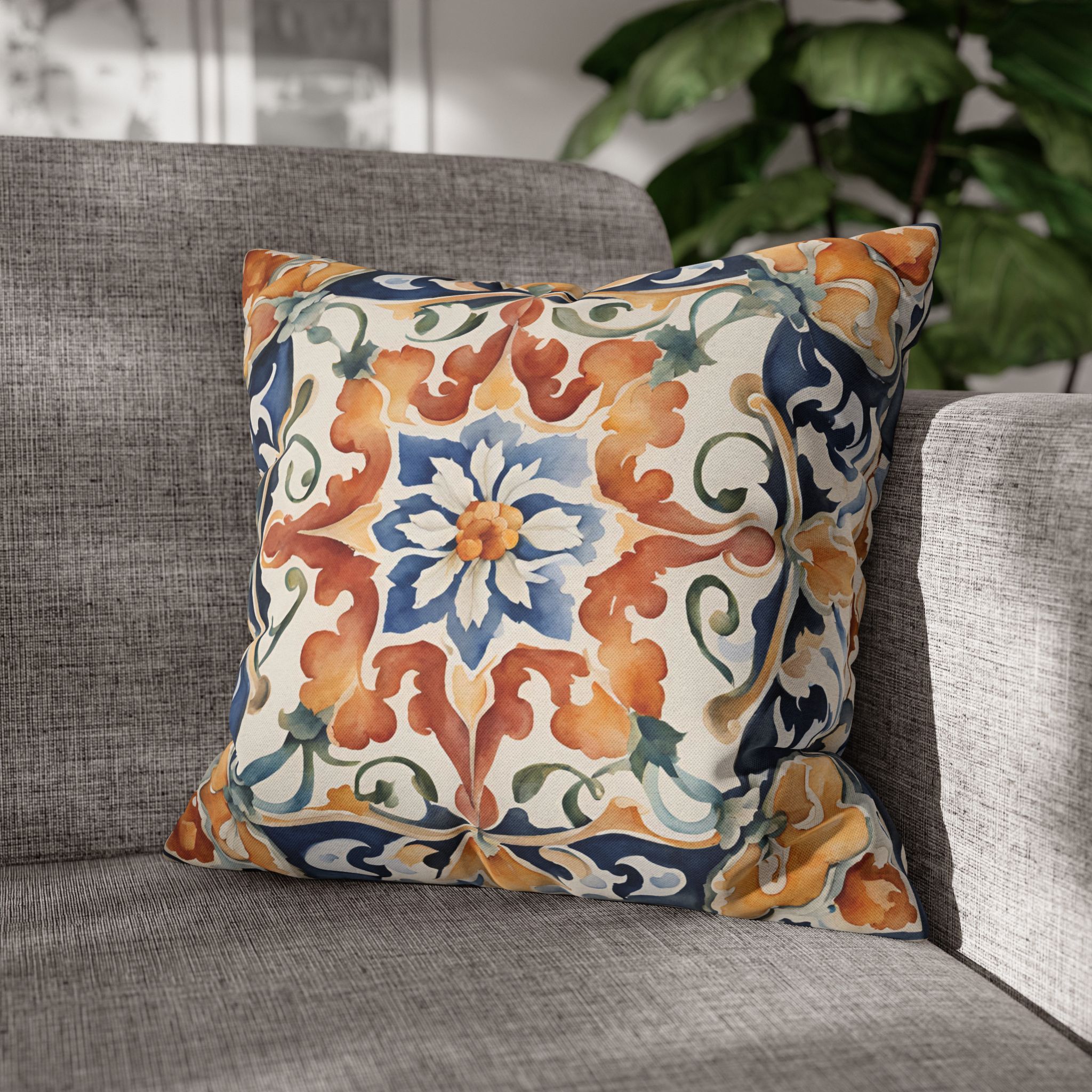
Acanthus Azulejo carries an even older motif — the acanthus leaf travelled from Greek capitals through Roman mosaics into Iberian tile, surviving every change of taste for two thousand years. Here it curls in rust and ochre around a single blue-and-white flower inside a navy border, and that border is the point: it gives the design the structure of a framed tile panel, so it holds its shape against busy upholstery where softer patterns get lost.
Baroque, and knowing when to stop
Portuguese baroque tilework was never modest. In the great houses of the eighteenth century, panels grew denser until the wall disappeared beneath them. Baroque Azulejo is drawn in that spirit — navy, cream and antique gold folded into a single flowering ornament.
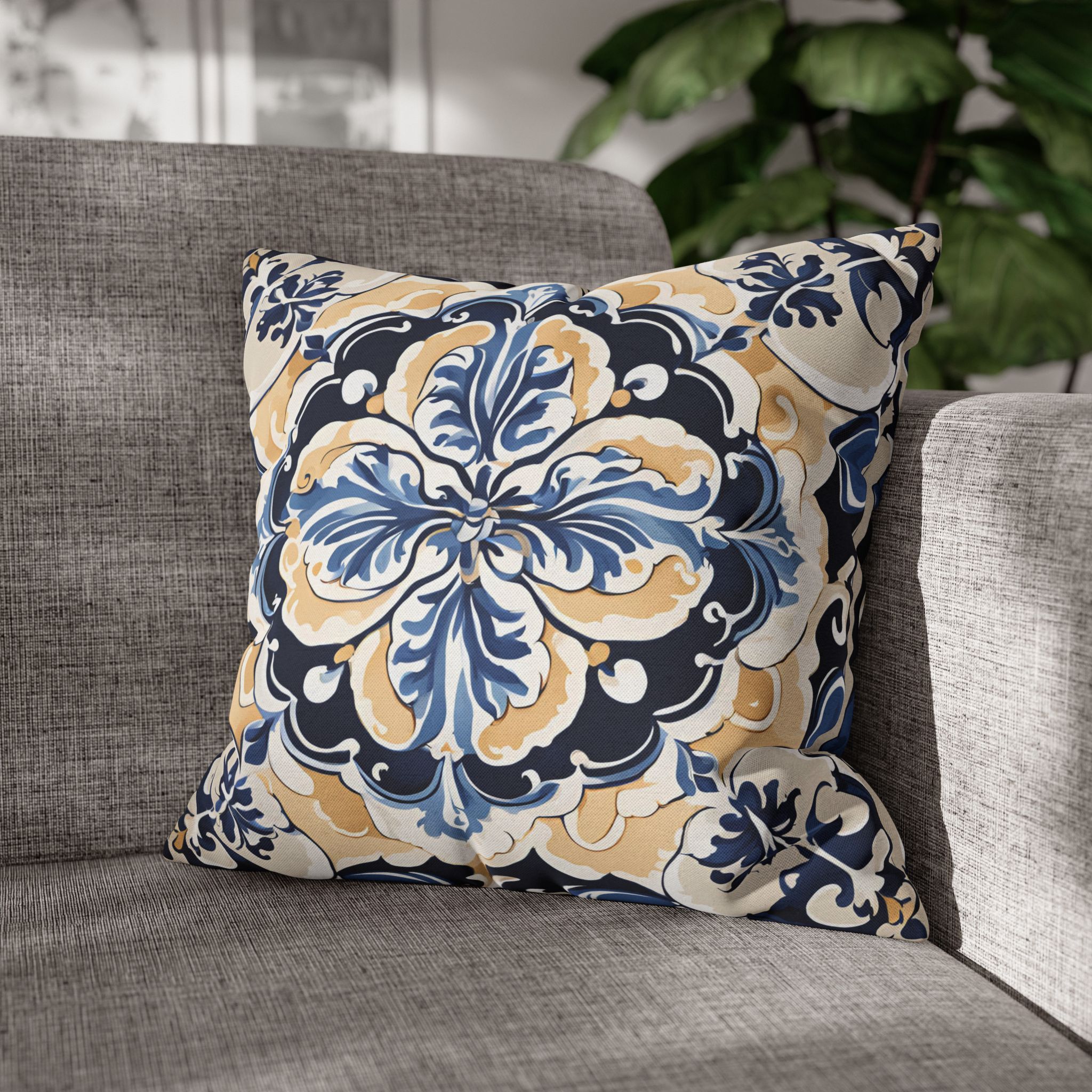
It comes with a warning attached. Give it space. One on a plain sofa reads as an heirloom; three of them competing reads as a showroom. Brass, dark timber and cream linen are its natural company.
The faded one that fixes a group
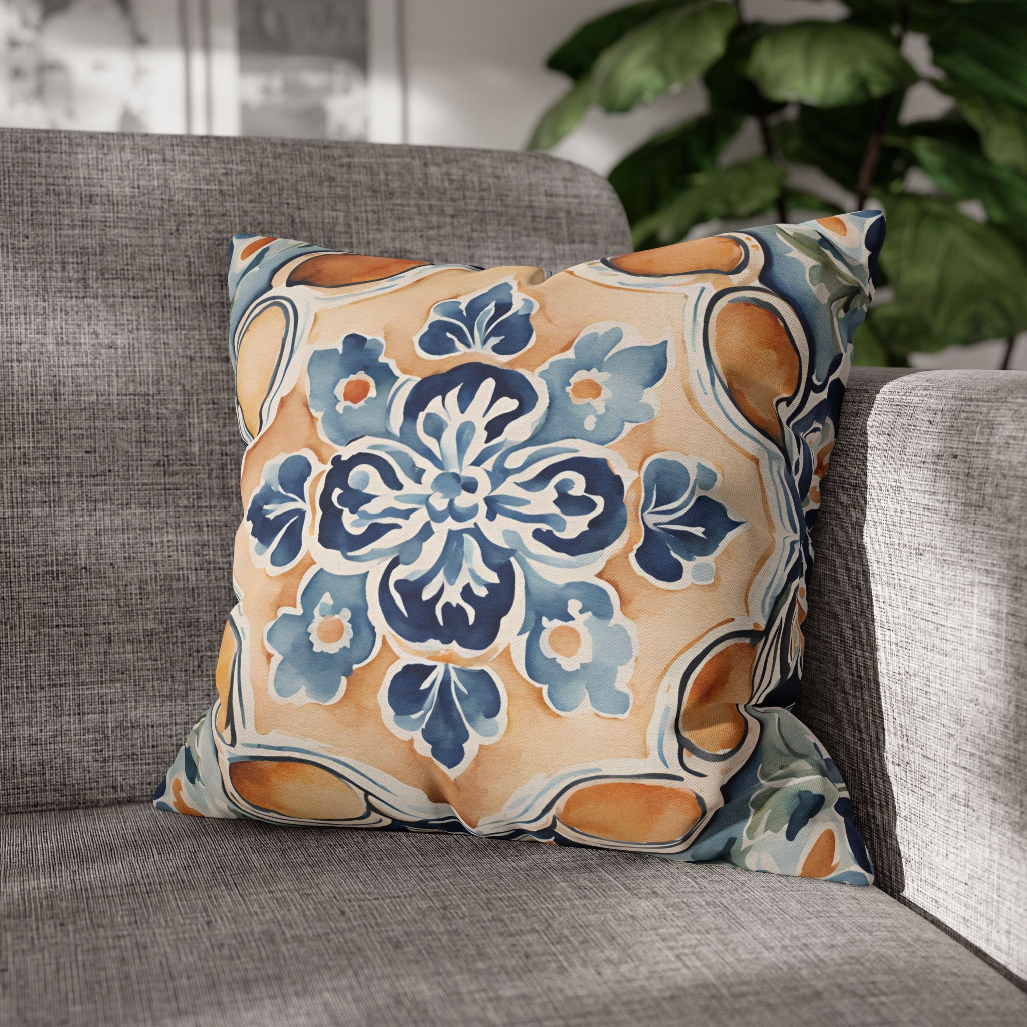
Apricot Azulejo is what a tile looks like after a century in the sun: the cobalt gone soft, the white ground warmed to apricot, the edges no longer crisp. The design leans into the fading rather than fighting it.
Its practical use is as a bridge. Put it between a navy cover and a cream one and a group that was not quite resolving suddenly does. If you own two tile covers that fight, this is usually the third one that settles them.
Using tile pattern in a room with no tiles
Three things make it read as architecture rather than as a novelty print.
Let the repeat run off the edge. A motif centered inside a square looks like a picture of a tile. A repeat that continues past the seam looks like a fragment of a wall, which is the effect you want.
Keep the count low. Tile is dense. Two tile covers on a sofa is a statement; four is wallpaper. Pair them with plain linen, or with a stripe, rather than with another pattern of similar weight.
Answer the border. Designs with a drawn border — the Acanthus especially — want a hard edge somewhere else in the room: a dark timber frame, a black lamp base, a straight-edged shelf. Without it they can look like they are floating.
All seven designs sit in the Portuguese tile collection. Seven is the whole of it, deliberately — it is the smallest collection in the catalog and there is no filler in it.
Tile pairs unusually well with coastal stripes and checks, which is covered in coastal throw pillow combinations. For sofa-specific advice, there are guides for beige, blue and green sofas.
What arrives
A cover on its own. No pad inside, a concealed zip along one edge, the design printed on both faces of 100% polyester so there is no wrong way round. Seven sizes, 14 to 28 inches. Each is made after the order rather than pulled from a shelf, which is the reason a change of mind cannot be taken back — a fault or a mistake on our side always can.
The softest of the seven is the Apricot Azulejo: blue tilework painted over a warm apricot ground, easier to place in a room full of neutrals than the classic cobalt.
Where to start
One cover, and make it the Cobalt at 20 inches. It is the least demanding of the seven and it tells you quickly whether you want tile pattern in the room at all. If the answer is yes, the Saffron is the natural second, and the Apricot is the third that holds them together. If your sofa is blue, the blue sofa guide covers how tile behaves against it; if it is beige or cream, start here instead.